There are a range of simple techniques that can be employed by web designers to add the finishing touches to a website design, giving an extra level of detail that makes the design jump from the screen. Jacob Cass takes a look at five of these polishing techniques that can be easily implemented in your next design project to give dramatic results.
First and foremost, this article is not for advanced web designers, as you will more than likely know these tips but you may be surprised by one or two tips, who knows?
These tips are focused on making your website more ‘polished’ which I will explain by outlining some techniques I have used to create this chocolate gift basket website.
1. Use Anti Aliased Text
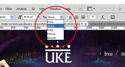
Something that is often over looked when designing for the web is the use ofAnti-Aliasing in your image based text. For those who don’t know, anti-aliasing is the technique of minimizing distortion artifacts. There are a few ways to minimize this distortion in your text but the best way is to make use of your ‘Character’ panel. You can choose between None, Sharp, Crisp, Strong and Smooth. The best way to see what works best is to experiment as different fonts and sizes will yield different results however the sharp setting usually prevails in most cases.
2. Use Subtle Contrasting Stroked Borders
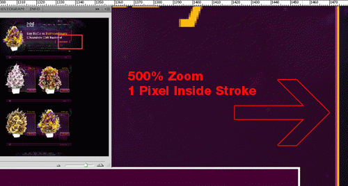
Something that really makes a difference in making a website pop is the use of 1 pixel stroked borders and lines. These stroked borders really add that extra crispness to the design as it gives extra contrast to the surrounding elements and gives the design more depth. Notice the zoomed-in screenshot above; see the inner purple lines that run alongside the inside of the boxes? You can add these 1 pixel borders by using your stroke option found in the ‘Blending Options’ or ‘Layer Styles’ panel. This technique also works great for large text.
3. Use Subtle Gradients
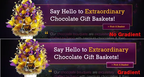
Gradients are popping up everywhere in web design and for a reason – they add depth and real aesthetic to the design. Unlike print design where gradients seem flat, on the screen they make a design come alive. Notice the slight dark to light purple gradient in the screenshot above? Also take note of the slight transparency. These effects give the design a new dimension, making the image come off the screen so to speak. Use the ‘Blending Options’ or ‘Layer Styles’ in Photoshop to create these nice subtle (emphasis on subtle) effects.
4. Use A Grid

Although it may sound like basic knowledge, I know for a fact that not all designers use grids however they are extremely useful and in my opinion, vital. Alignment and spacing in web site design creates order, organizes the page and groups parts of the website for easy navigation. In the screenshot above you can see the guidelines in place ensuring everything is aligned (the grid template is from www.960.gs). Notice how the logo and all of the text is left aligned? Also, take note of the even spacing around the boxes and text. Use the guidelines in Photoshop to ensure all of your elements are aligned which can be done by dragging ‘rulers’ from your rulers tab. Press Ctrl+R to turn rulers on.
5. Use Levels, Curves & Unsharp Masking
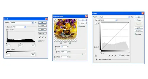
In web design, photos, icons and images are usually quite prominent so you should ensure that they are of the utmost highest quality. Check the color balance, sharpness and contrast of each image and make certain that it balances with the rest of the page and other images. A good way to do this is to make use of Photoshop’s ‘Levels & Curves‘ & ‘Unsharp Masking‘ tools. Click on the links provided to show how to do this – these functions go beyond the scope of this article.
Anyway, hope these tips help in polishing off your next website. Do you have any other not so well known web design polishing tips?
No comments:
Post a Comment